Topic Three: Rhinoceros Part Three - Portrait/Propaganda
Topic Three: Rhinoceros Part Three - Portrait/Propaganda
This was certainly an interesting experience, and not necessarily a bad one. As I have stated previously, I do not like drawing people. And I didn't quite understand just how anthropomorphized the original person or character you were making the works of could acceptably be. So I decided to play it a bit safer, but still enjoy myself. I chose to do the work on a character from a game I quite like (and has destroyed me emotionally on several occasions), NieR: Automata, with that character being one of the main three, the android 9S. I'd never properly drawn him before, so I decided it was a way of killing two birds with one stone, so to speak.
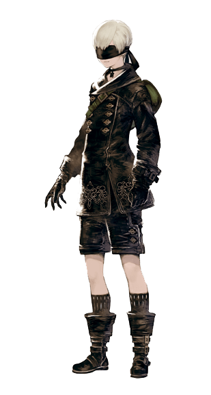
9S' official illustration
So for the portrait, I decided to go fairly simple and depict him as he appears and is; young (I'm surprised no one pointed it out in class actually, that it's pretty odd an android soldier of all things looks almost like a young boy. Child soldier almost? If he weren't an android anyway) a little smug about his skills, but altogether very bright and curious.


Just some quick sketching before I dive into the nitty gritty.


And here's about where I start thinking, 'wow digital painting has a really nice outcome but boy will my wrist not thank me after these next few days, why'd I do this.'
But I soldier (heh) on. I decided on a fairly neutral color pallet from the get go to emulate the world in which he lives. I establish a light source and begin some rendering on the hair.

Many, many layers later (about 27 from what it says here), 9S is nearly fully rendered. I've cleaned the sketch up and painted over it to get as much of a 'realistic' look as possible. In the portrait, I decided he'd be holding onto his visor instead of wearing it because he's being open in this moment. (The symbolism of the visor in the game is a play on the saying 'see no evil', and being 'blind' to truth. Only YoRHa androids wear them. The visors don't physically blind them (because of course, they're androids.), and some even speculate the game specs like levels and such are displayed to the androids via the visors, but who really knows)

He's done! More detail went into his hair, including little wisps and loose hairs to reinforce the look I'm trying to give him. With this illustration just about done, I moved onto the propaganda portion.

Another starting sketch. For this illustration, to push the propaganda's message, 9S dons his visor again and his confidence in his skills will be on full display.


For the look of this piece, I already had the idea in my head of creating something with a style akin to a piece I saw in the Wolfsonian. I do not recall the name, but it is a piece I spoke of before, a German poster that encouraged German families to have children in order to grow their 'perfect' race. So, drawing off that, I emphasized these sharp lines and edges in the final mock up.

Added in the flats to establish my base color scheme, another echo to the game's subdued colors.

Established a light source and began to layer on shading in the same style as the lines. Probably my favorite part! I love seeing the end result of working shadows up from the palest to darkest.

I do the same with lighting, play around with a possible gradient, add in details for his uniform, and draw up his hacking circle. (9S is a Scanner unit (that's what the S stands for). He hacks into enemy bases and machines to find info or take them over, and excels at his job. Problems arise however, when our very eager friend here doesn't just limit his curiosity to the enemy.)

Added in the background of the city, edited the gradient a bit more, and added in some dynamic shapes for some added movement.

Finished up by heading into Photoshop Elements and adding in the text. The text on both images is called 'Fortune City'. It's the same dialogue text used in Automata.


The finished pieces (both 8.5 by 11 inches)
It would be all fine and dandy if that were the end of it, but unfortunately (for past me) it was not. I had from the get go wanted to add animation to the images (particularly the text on the propaganda piece). However I ended up overestimating what I could do with limited programs, and had to simplify the animations.

For starters, I don't have an animation program at home. Thus, I have to save each frame of the animation as its own image.

Images of which, took very long to save (These sizes...are not ideal for gifs. Or animations. Anything digital really. I was so fixed on the set size that it didn't occur this would interfere with my plans until...I hit this point.). (And ah, a background. For this image, I chose to do a rendering of an area in the game.)

And took even longer to try to stitch together in a video editing program. (OpenShot Video Editor...leaves a lot to be desired, when you've only ever worked with Premier before. Eventually I gave up and went to put the images together in Windows Live Movie Maker. Again, leaves a lot to be desired, but at least I had more experience with it.)
And that would have been the end of it...had I not found TYPOS.
Then I really had to step away. Turns out YoRHa was spelled with different capitalizations, two DIFFERENT ones unique to each piece (and neither was accurate to the actual spelling to boot). I debated with myself for a while whether to go back and change them and repeat the entire process again, whether anybody would notice, before the perfectionist in me finally won out and I did it.
I might've been dead inside by the end of it. But, they were done. Though I wasn't quite yet. In order to be well prepared for presenting, I brought in both videos, as well as uploaded them onto YouTube and saved the links. And if all else failed, I had the two still images on my USB as well.
(Make sure they're HD. Then right-click the videos and set them to 'Loop' to see them as intended)


Overall, the critique went better than I expected. Obviously the knowledge of this world is limited in ours, so the propaganda was a little out of touch. But I did my best to add in as much context as I could without burying the image in text. The videos didn't quite come out as big as I wanted them to on screen (not sure if it was the projector, the videos themselves, or a combination of the two), but since people actually recognized and identified the series and tied it into the propaganda, I'm pretty happy.


Comments
Post a Comment